BasicTextField bubble wrap
A little hack for adding (content) padding to your (decoration) boxes.

Jetpack Compose's BasicTextField component is very basic. It's an unstyled rectangle that you can type into. As is, it's not very user-friendly; it doesn't even have a border, so you can't see where it is! Design systems like Google's Material style text fields by wrapping them with colored borders, fancy animating labels, etc. All these decorations automatically get all the focus, interaction, and semantics from the field because the use the decorationBox API. BasicTextField takes an optional composable function wrapper that allows you to insert whatever you want between the outer bounds of the field and the inner area that is actually editable.
The problem
If you're building a design system, one thing you might want to do is add some padding between the border and the editable area, so the text doesn't look too cramped up against the border. The simple way to do this is to apply a padding modifier inside the decoration box, e.g.:
BasicTextField(
…,
decorationBox = { editableContent ->
Box(
propagateMinConstraints = true,
Modifier.padding(8.dp)
) {
editableContent()
}
}
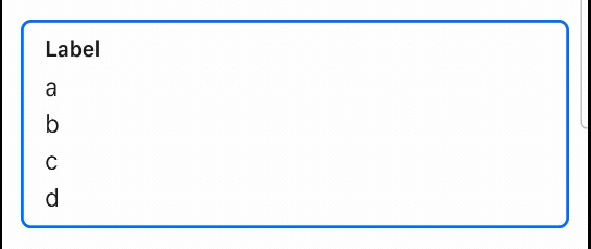
)The problem with this approach is that, when the field is scrollable, the padding is wasted empty space:
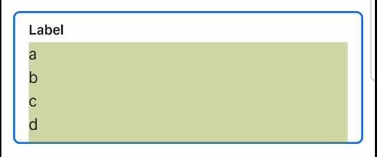
Ideally we'd like to only have that padding show up when the field is scrolled all the way to the bottom, like this:
This is very similar to a problem that LazyColumn would have, but LazyColumn has a contentPadding parameter that lets you insert padding that only applies to the scrollable content, not the viewport (the bounds of visible scroll content).
The solution: Content padding
Text fields are similar to lazy columns in that they're both scroll containers that don't give you direct access to the scrollable content. Content padding is useful in both cases for the same reasons. But BasicTextField doesn't (as of the time of this writing) support it. There's a feature request to add content padding to BasicTextField that's over a year old. I feel somewhat guilty for not adding this before I left the Compose team, but there was just so much to do…
Anyway, now that I use Compose from the outside, every deprioritized bug is just an excuse to spend a Friday afternoon doing terrible, terrible things. This week's terrible thing was—you guessed it—hacking support for content padding.
The hack
We can fake content padding by detecting when the field has been scrolled to the end, and only adding padding at the end. To make it smooth, we want to add padding incrementally with each scroll frame. And to keep the size of the overall field consistent, when the padding isn't shown we need to extend the size of the inner field. We need to intercept the scrolling in some way to add our padding.
tl;dr: If you want to see the code, scroll to the bottom!
This is a perfect use case for nested scrolling! We can pass a NestedScrollingConnection and listen to onPostScroll events to detect when the field has stopped consuming scroll deltas. This is a hint that the field is scrolled all the way. We have to do a lot of guesswork since, until BasicTextField2, there was no way to observe the internal scroll state of a field, and the design system I'm working on is still using the old API (hopefully not for long). Then we can use onPreScroll to detect when scrolling the other way, and intercept the scroll to shrink our padding out before letting the field scroll itself.
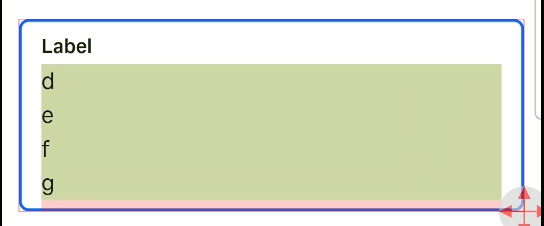
To visualize this, I added some colors. You can see the inner field in green, and when the field is scrolled to the bottom, that little red area is where we're shrinking the field and replacing it with empty space.
We also need to handle the case when the field shrinks. When this happens, the field is no longer scrolled to the end. However, since we are using the legacy BasicTextField, we can't actually detect that directly on the ScrollState. We can guess by observing when the viewport changes size and, when it shrinks, reducing the padding appropriately.
Alright enough talk, let's see the code! First of all, here's how you apply the hack to a field:
// This is a little helper class we'll define below.
val scrollConnection = remember { DelegatingNestedScrollConnection() }

BasicTextField(
  …,
  // The nestedScroll modifier must be applied to the field since the
  // inner scroll container is actually the entire field, not just the
  // editable area.
  modifier = Modifier.nestedScroll(scrollConnection),
  decorationBox = { editableContent ->
    Box(
      propagateMinConstraints = true,
      // This is the meat of the hack.
      modifier = Modifier.textFieldContentPaddingHack(scrollConnection)
    ) {
      editableContent()
    }
  }
)
And here's the actual implementation. It's a bit long to embed in a blog post, but it's too hacky (and too short, really) to bother with a library. I also assume there's a good chance that if you're using this you'll want to modify it to suite your own specific needs anyway.
Closing thoughts
I don't know if I've mentioned it, but this is a hack. There are edge cases where it doesn't work great. But it is better than nothing. I spent way more time than I should have scratching this itch because in text fields, space is precious, and seeing it wasted annoys the heck out of me.
Design-minded readers may have noticed the component in the gifs doesn't look like Material's TextField. Good catch! They're from Square's internal design system, where I'm hoping to ship this soon.
If you're reading this article through the fingers of a facepalm, go ahead and +1 the feature request that will make everything here obsolete: https://issuetracker.google.com/issues/302599627.