Centering in Compose

Let’s talk about centering things. There is no Modifier.center() in Compose, nor is there a Center composable, and I think the reason for that is because once you understand Compose's layout system you'll find those concepts redundant. In this article I'm going to try to explain the theory behind “centering” in Compose without assuming you know anything about the specifics of Compose's layout system. If I'm successful, hopefully you'll come away with a better intuition for how to think about layouts in general.
Compose's constraint-based layout system is extremely powerful. When you're trying to achieve a layout result it might be tempting to just throw modifiers at a composable until the preview looks the way you want, but that approach will often produce unexpected and incorrect behavior when your composable is used in a different context. Thinking in terms of constraints helps you realize all the layout edge cases your composable might need to deal with. Sometimes you don't care about some of them, and maybe you even want to explicitly not handle certain cases (e.g. maybe you don't have a preferred size, so if there's no minimum constraint you are content to just be zero-sized). Once you've fully enumerated how you want to respond to the full range of constraint possibilities you can select the layout modifiers that will accomplish that goal without having to try them all.
For this post, I think it's slightly more common in most UIs to center horizontally than vertically, so for simplicity I'll focus on that (all the same principles apply to vertical centering, and they operate independently).
First, definitions
What does it mean to center something? It means placing something in the middle of its parent. To center something we have to know how big the parent is. We could write a centering algorithm like this:
- Get parent width.
- Get child width.
- Calculate child offset: Left is half the parent width minus half the child width.
- Place child at that offset.
We could write some code to do that math:
fun centerChild(parentWidth: Int, childWidth: Int): Int =
  (parentWidth / 2) - (childWidth - 2)
Compose has an API that lets you write code like that: Alignment.Horizontal. This interface has a method align that lets us write pretty much that exact code—but only with certain high-level APIs that explicitly support aligning things (I'll talk more about these later).
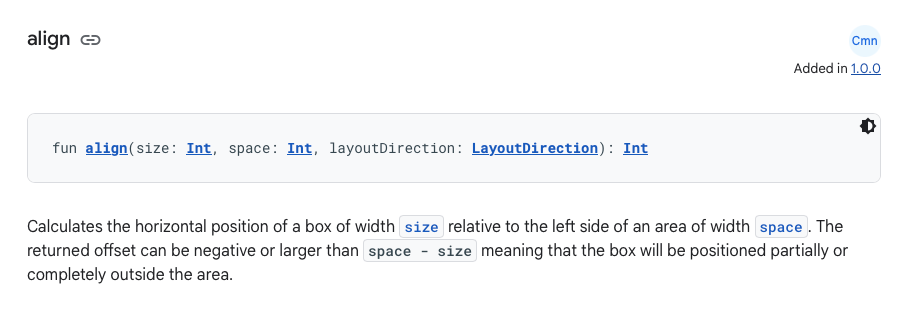
When you use Alignment.CenterHorizontally, that's what you're using. But it would be a cop-out to leave it there, since Alignment can only be used with higher-level concepts in Compose, so we haven't covered anything interesting yet. For example, where do the size and space parameters come from? What is the return value used for? To answer these questions, let's examine each of the steps of our algorithm one-by-one.
Getting the parent width
Some containers support aligning their content directly within themselves (e.g. Column, Box). When placing their contents, these containers already know how big they are so they can use that information directly when calculating alignment. However, sometimes you want to center something without knowing what container it will be in, or if it even supports alignment at all.
And even worse, sometimes the parent doesn't even have a definite width! Many container composables couldn't care less what size they are and just wrap themselves around their content. If there's a single child, then the sizes match, and, sure, the child is technically centered in the parent (and left-aligned, and right-aligned, etc). But then our immediate parent might not be centered in its parent, or its grandparent, etc. So when we say we want to center something in the parent, we don't necessarily mean we want to center it in the immediate parent. What we actually mean is that we want to figure out how much space is available and center inside of that. We might have to look up several ancestors to find anything that has an opinion about its size. But besides being inefficient, Compose doesn't provide a way for something to directly walk up the layout tree at layout time. Luckily, Compose has a much more elegant solution to this problem.
Instead of making each parent tell its children exactly how big it is, parents tell their children what range of sizes they are willing to be. These layout constraints are represented by the Constraints type. Containers that don't care about their size will just forward whatever constraints they're given to their children. More discerning containers can narrow the size range they pass down. To help illustrate this point, here's an animation that shows how a child might react to the constraints it gets from its parent.

In this example, arrows pointing inward indicate maximum constraints and arrows pointing outward indicate minimum constraints. The child has a default size that it prefers to be when possible—maybe it's an image that tries to be the original image size, but can scale up or down if necessary.
There's a lot more to be said about constraints, but for now let's take a deep breath and, ahem, center ourselves, and focus on our main goal.
To get the “parent width” for our centering algorithm, what we actually want is to find out how wide we're allowed to be. We look at the constraints our parent gave us and declare we will be the widest possible. By claiming all the available width, we've taken the placement decision away from whatever ancestor originally specified the constraints: we'll only fit at offset zero. We'll get full control of where our content is placed inside that space. Modifying the above animation, note that the incoming minimum size gets ignored, and “Max width constraints” only has a maximum width, not a minimum:

Before we move on, there's one case where this doesn't work. Certain special containers place no upper limit on their content's size, no matter what their incoming constraints are. I'm talking about Modifier.horizontalScroll(). The whole point of scrolling is to allow content that is larger than the available space to still be accessible, so scroll containers generally let their content be as large as it wants. What does it even mean to center something in infinite space? Can you center something in the sky? In outer space? (Astronomers, stay out of the comments, the analogy doesn't need to be perfect.) The only reasonable thing to do when there is no maximum width is to just give up with the whole centering thing and fall back to just matching the content's size.
Now that we've covered some concepts, here's the eye-straining wall of code that Compose makes you write to achieve this:
Modifier.fillMaxWidth()Modifier.fillMaxWidth clamps the minimum constraints to be the same as the incoming maximum constraints. This is the “fill” part. Here's a visual representation:

@Previews. Ok, but I promised a wall of code. We can write this logic more explicitly, in terms of actual constraints:
Modifier.layout { measurable, constraints ->
  val width = if (constraints.hasBoundedWidth) {
    // Claim all available space.
    constraints.maxWidth
  } else {
    // We're in a scroller (or something similar), so centering is
    // meaningless.
    TODO("get default width")
  }

  layout(width, TODO("height")) {
    TODO("placement")
  }
}
Ok, so it's more of a curb. There's still a lot here if you're not familiar with Compose's layout system. Modifier.layout creates a modifier that wraps the modified node (what the modifier is passed to) to insert some measurement and placement logic between the modified node and its parent. The lambda's measurable is a layout proxy for the modified node. The layout modifier's only requirement is that it calls the layout function to specify a width and a height for itself. For more information about layout nodes, see the official docs. Note that hasBoundedWidth is just shorthand for maxWidth != Infinity. Over the rest of this article we'll revisit these two code blocks to build up a modifier that can center anything in anything. If you're not familiar with the layout modifier, here are the docs.
Getting the child width
This step is a lot more straightforward. Since we've already declared ourselves to be as wide as possible, it doesn't matter what the minimum width constraint is, so we'll remove it before passing the constraints to the child. We're just going to let our content be as small as it wants and leave the extra space empty. In the animation from earlier in this post, remember that the child size is only affected when the maximum width is smaller than the preferred width. Here's that animation again:

That's basically it, so let's update our modifier chain:
Modifier.fillMaxWidth().wrapContentWidth()We add wrapContentWidth to remove the minimum constraints. On its own, the wrapContentWidth modifier looks an awful lot like the “max width constraints” concept we started with:

I've been specifically trying to avoid conflating measurement with placement in these diagrams, so it's hard to see the difference, but the important thing is that while wrapContentWidth does forward the maximum constraint to its child and not the minimum constraint, it doesn't automatically take up the entire width. If the minimum constraints are too small, it's basically just a no-op. Notice the “area for centering” in the above animation – it never gets bigger than the child, which means it's not doing any interesting placement. For that reason it's only really useful if you want something to be smaller than the minimum width constraint. fillMaxWidth tends to make that minimum constraint relatively large, so they work great together!

Now the “area for centering” matches the full available width. We can also do this combined behavior manually in our custom layout modifier:
Modifier.layout { measurable, constraints ->
  // We're going to always satisfy the incoming minWidth constraint
  // ourselves, by filling available space, so we can handle the
  // content being too small.
  val childConstraints = if (constraints.hasBoundedWidth) {
    constraints.copy(minWidth = 0)
  } else {
    // If we can't center, then we're going to match the content
    // size, so it needs to satisfy the minimum width constraint.
    constraints
  }
  val placeable = measurable.measure(childConstraints)

  val width = if (constraints.hasBoundedWidth) {
    // Claim all available space.
    constraints.maxWidth
  } else {
    // We're in a scroller (or something similar), so centering is
    // meaningless, and we'll just match the content size.
    placeable.width
  }

  layout(width, placeable.height) {
    TODO("placement")
  }
}
Calculating the offset to center
(And also placing it, because they're basically the same step.)
Folks, I have some bittersweet news. That modifier chain we've been building over the last two sections? It's done. Modifier.fillMaxWidth().wrapContentWidth() is its final form.wrapContentWidth allows its content to be as small as it wants, but that means it has to handle the case where that is smaller than the minimum size. It handles that case by just leaving the extra space empty and aligning the content within that space. The alignment is determined by an optional align parameter that defaults to, you guessed it, CenterHorizontally. The only reason we need fillMaxWidth is to tell the wrapContentWidth how much space to take up: all of it.
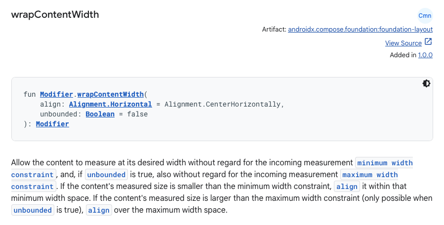
To see how it does this, let's update our custom layout modifier. We've already written some code for this. Remember our centerChild function?
fun centerChild(parentWidth: Int, childWidth: Int): Int =
  (parentWidth / 2) - (childWidth - 2)
Now we can finally use it for real!
Modifier.layout { measurable, constraints ->
  … // Omitting all the measurement code, we still need it though.

  layout(width, placeable.height) {
    val x = centerChild(parentWidth = width, childWidth = placeable.width)
    placeable.place(x = x, y = 0)
  }
}
Now approaching wall-sized code.
Putting it all together
I've been showing custom layout code along with standard modifiers to explain the effect they have together in terms of low-level layout concepts, but in the real world you should never write a custom layout just to center something. The modifiers are much less code, and once you're familiar with this idiom, clearly express your intent to center (or align however you choose).
The only interesting way the custom layout is different than the modifier chain is that fillMaxWidth and wrapContentSize each use a layout modifier internally. The custom layout does the same logic but all at the same time, with a single modifier. Layout modifiers are relatively cheap, and the difference of two compared to one is not significant, especially given how much more concise and readable the standard modifier chain is. We recently refactored a bunch of code in our codebase that was using custom layout logic to do some centering of some content, apply a maximum width, and some padding. It took me embarrassingly many reads of the original code to figure out that the intent could actually be expressed in a handful of standard modifiers. This resulted in not only less code but also a clear separation of concerns (“this modifier applies padding, these do centering, etc”) which should be a lot easier to maintain in the future if only one of those requirements changes.
Other approaches
One other approach I haven't covered is using a Box to wrap your content. Box also takes an align parameter, just like wrapContentWidth, and it does the same thing. I don't recommend this approach unless you need to stack multiple things on top of each other. You'll probably end up passing Modifier.fillMaxWidth to the Box anyway, so it ends up being roughly the same amount of code, but now the rest of your composable is also indented one more level. In fact, almost anything you can do with a Box with a single child you can just do with a modifier or two, and I usually prefer modifiers. But it really is more of a style/personal preference matter than anything else. In my opinion, the main reasons to use Box are these:
- You need to apply a modifier to a composable that doesn't accept a
Modifierparameter (e.g. a content lambda). In this case, make sure to also passpropagateMinConstraintsor you're effectively adding awrapContentWidthto the end of the modifier chain you pass toBox, which is rarely intentional. - You need to use a modifier chain to do something but don't need a leaf
Layoutcomposable node. This uses the overload ofBoxthat doesn't take a content function. - You need a Z-stack, layering multiple composables on top of each other.
What's not a matter of personal preference is the use of BoxWithConstraints to perform layout calculations. BoxWithConstraints is great tool when the constraints determine what is present in the composition (i.e. which composables you call). It is a terrible tool to determine how to measure or place content. It uses subcomposition, which is very expensive. It also changes how the phases of composition are ordered: it runs your child composition in the layout phase of the parent. It also prevents any direct parent nodes from using intrinsic measurement. Performing layout logic is a fundamental element of any UI toolkit, and Compose has a very capable layout system designed to do exactly this.
If you're just using
BoxWithConstraints to do some layout math, just use the layout system. Your code will be more modular, more performant, and play nicer with others.Conclusion
Compose's constraint-based layout system is extremely powerful, and this article has only scratched the surface. There's a whole article in the official docs about layout constraints and modifiers that I'd recommend reading as well. Thinking about your layouts in terms of constraints will make you a better Compose developer and get you from design to code much quicker than just experimenting with modifiers without understanding what they mean.
Next time you need to center something, use the fillMax*.wrapContent* idiom, wrap it in a Box, or even write a custom layout if you need to do a whole lot of other things besides centering and you think it's more readable. Just don't use BoxWithConstraints.
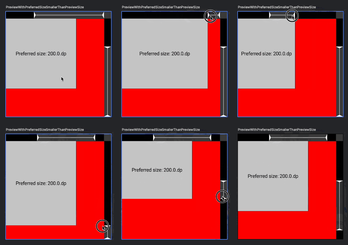
As I wrote this article, I realized it might be helpful for learning and debugging to be able to manipulate the incoming constraints for @Preview functions, so I made a little library to do that: constraints-explorer. It gives you controls in Interactive Preview Mode so you can drag the constraint limits around and see how your composable interacts. Check out the README for more details.

Thanks to Keith Abdulla and Darshan Parajuli for reviewing this post.


